BikeMaps.org
  • Home
  • Visualization
  • Blog
  • About
  • Español
  • Français
  • Íslenska
  • Guest
    • Log in
    • Register

BikeMaps Blog

  • Jan 15

    Promoting Bicycling in Lethbridge - One Revolution at a Time

    Jan 15
    Tweet

    by Tyler Stewart (BikeBridge Cycling Association)

    Just like a tough uphill climb, sometimes you have to focus on the struggle one pedal crank at a time. Here in Lethbridge, it’s been a slow and steady grind but it seems like we’re finally starting to gain traction.

    Like most urban centres, the windy city of Lethbridge (population nearing 100,000) was designed around the motor vehicle, not the bicycle. But a small group of dedicated folks have pushed forward to ensure the velocipede isn’t completely forgotten in its role to build a healthy, happy community.

    JR16 Jane's Ride 2016

    BikeBridge Cycling Association came together in 2010, when the City of Lethbridge had proposed a new cycling bylaw that included mandatory helmet regulations, and lumped in cyclists with all other “personal conveyance devices” such as rollerblades, skateboards and wheeled skis (does anyone still use those things?!). The proposed bylaw was dumped, but it’s taken many years to make progress on the bigger issues finally addressed in the recent Cycling Master Plan. Though far from perfect, it outlines an infrastructure network that will encourage safer cycling throughout the city to be developed over the next 20 years.

    Film Bike in Film Night

    While the lengthy timeline is frustrating (as is the lack of focus on education and awareness), BikeBridge has remained focused on developing the cycling community through a variety of events and initiatives to bring cyclists together. During the 2016 Tour of Alberta stage hosted in Lethbridge, a number of events like bike rodeos, cycle concerts and a bike-in film night helped promote the social aspect of cycling within the community. In 2017 we hosted a winter cycling film screening and held our second annual Jane’s Ride, a fun and informative historical cycling tour around town. We were also thrilled to participate in the BikeMaps.org initiative to gather more data around cycling hazards and incidents, which will hopefully lead to better designs around the upcoming infrastructure developments.

    concert Bike Concert

    This year, we’re looking to step it up a notch after receiving funding to host Lethbridge’s first-ever Bike Week program of events and activities. With group rides, workshops, another bike-in film festival and more fun ways to get out and ride, we’re hoping to foster more riders into getting out to “put some fun between their legs” this year in Lethbridge. In addition to reducing pollution and congestion on the roads, and being a great way to keep fit and have fun, BikeBridge is focused on the positive social role of cycling in our community.

    Getting neighbours out beyond their front door to cycle together and learn from each other’s differences will hopefully create a more inclusive and welcoming city – one revolution at a time.

    JR17 Second annual Jane's Ride (2017)

    Keep in touch with us through our website at bikebridge.ca, on Twitter @BikeBridge or at Facebook.com/groups/bikebridge

  • Jan 11

    Help us improve the bike safety map for Tempe

    Jan 11
    Tweet

    By Trisalyn Nelson

    Official bike crash reports account for 30-40% of all incidents. We used Arizona Department of Transportation (ADOT) bike crash data from 2009 to 2015 to map the 12 worst spots for bicycling in Tempe. But, there is a lot we still don’t know. Inform policy makers, advocates, and researchers about bicycling safety in your city! Map bicycling crashes, near misses, and hazards at BikeMaps.org.

    Map of crashes from official data sources

  • Dec 7

    Improving Cyclist Safety Around Heavy Vehicles

    Dec 7
    Tweet

    By Moreno Zanotto

    In the fall of 2016, Transport Canada assembled a working group to identify options for mitigating the safety issues surrounding cyclists and pedestrians (known as vulnerable road users, or VRUs), and heavy goods vehicles (HGVs). As a stakeholder in cycling safety and a Public Health Agency of Canada funded project, BikeMaps.org has provided input and feedback on the countermeasures being assembled.

    Collisions with motor vehicles present the greatest safety threat to people cycling[1], and heavy vehicles (including trucks and buses) are overrepresented in fatal collisions with cyclists[2]. There are numerous interventions that can help improve road safety for VRUs (we’ll focus on cyclists in this post), although not all will be equally effective. For guidance on which interventions are most effective at protecting cyclists, we can look to the Netherlands, which has a large number of cyclists, yet has achieved some of the safest streets in the world. The Dutch strategy to improve road safety is known as Sustainable Safety. This philosophy treats the road system as inherently unsafe and regards humans as imperfect users of the system (we make mistakes and disregard rules)[3]. With that as the starting point, Sustainable Safety works to reduce the frequency and severity of collisions so that no one should die or be seriously injured on the road. Improving the subjective safety of vulnerable road users is also a key objective as feeling safe is very important to get more people to cycle for more of their trips. The results for the Netherlands has been impressive. Since the adoption of Sustainable Safety in the early 1990s, the number of traffic fatalities has decreased 45%[4].

    Under Sustainable Safety, the road system (itself comprised of people, vehicles and the roadway) is organized around five principles[3]. Under these principles, we’ve listed five interventions that can systematically improve road safety for cyclists:

    1) Homogeneity (of mass, speed, and direction)

    Road users of greatly different mass and speed (e.g. trucks and cyclists) are segregated unless differences in speed can be reduced. A sustainably safe road system separates cyclists from car and truck traffic along major roads while mixing users under low-speed conditions on residential streets.

    Segregate Modes on Major Streets (Build Protected Cycle Tracks)

    pic1-700

    Cyclists in a protected cycle track. People driving, cycling, and walking are segregated on this busier distributor road because car volumes and speeds do not allow for the safe mixing of different road user.

    Continue Separation of Modes into the Intersection (Build Protected Intersections)

    graphic - protectedintersection

    Protected intersections keep cyclists out of the truck’s blind spot and away from danger. Half of the fatal bicycle collisions with HGVs involve a side impact[1]—a problem easily avoided with safe junction design and signal timing. (Image credit: MassDOT)

    2) (Mono)functionality

    Roads are classified based on their function as either through roads for high volumes of fast-moving traffic or for local access to destinations and residences (plus a third type to connect through roads with access roads).

    Separate Bicycle and Truck Routes pic#3 
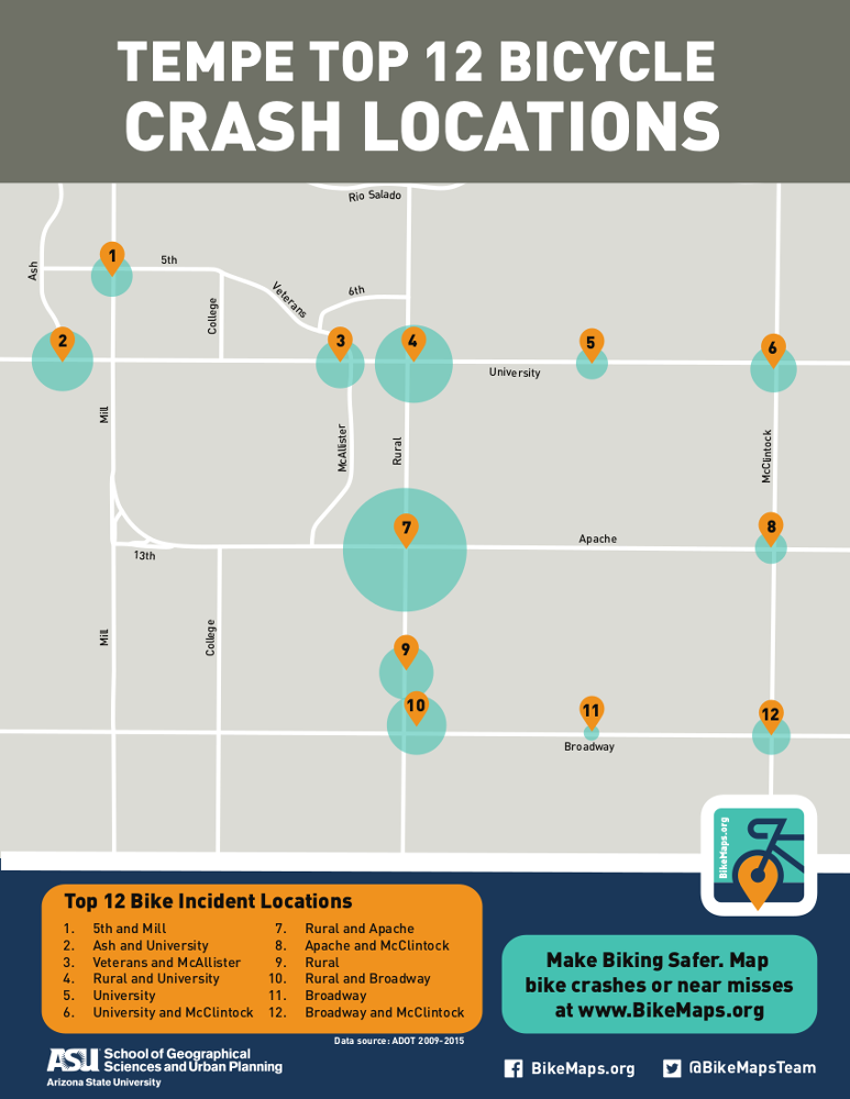
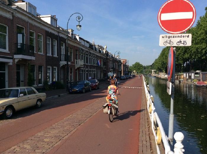
All residential streets are 30 km/h and employ some form of motor traffic calming, such as the ‘No Entry’ (except bicycles) sign on this local street in Utrecht. No long-distance car trips can be made on this street; it’s just for accessing the residences on this block. Mixed traffic conditions are possible because of low car speeds and volumes, otherwise, segregation of modes is necessary.

    3) Predictability

    Recognizable and consistent road designs make anticipating other road users’ behaviour (and where road users can be found) easier. The design should also encourage safer travel speeds.

    Develop Recognizable Road Surfaces and Consistent Priority Procedures

    pic#4 
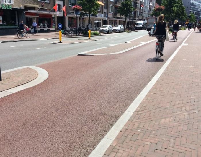
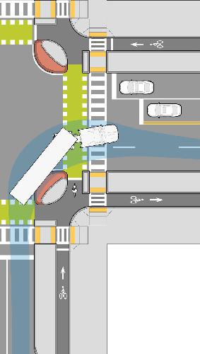
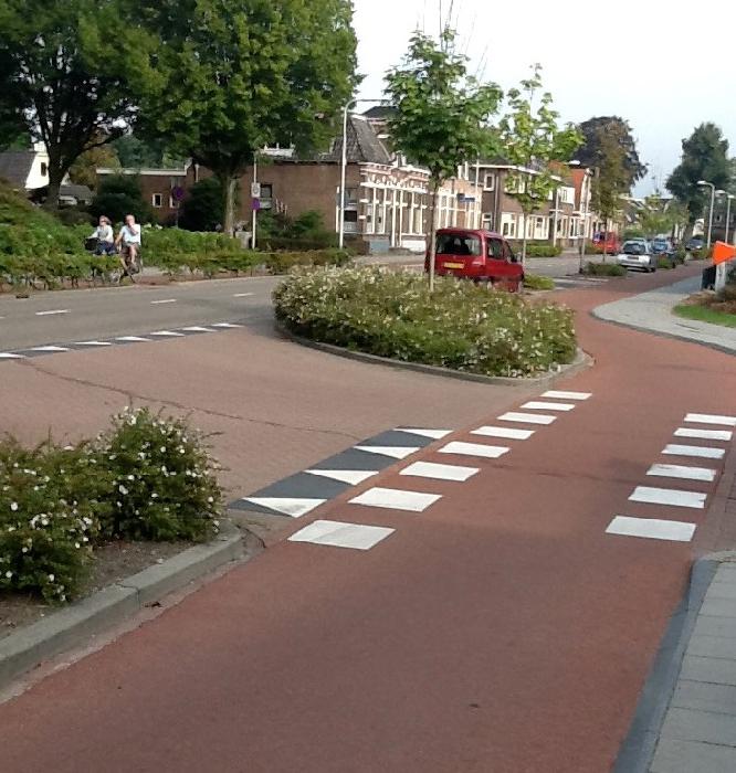
Features such as elephants’ feet (indicating a cycle crossing), sharks’ teeth (give-way markings), and red asphalt (only for cycle paths) create a consistent look and feel for crossings where cyclists have priority. There is no ambiguity here—cyclists will be crossing and they have the right-of-way. Clearly recognizable and consistent design leads to predictable behaviour and safer streets.

    4) Forgiveness

    When road users make mistakes (and they will), the design softens the consequences.

    Side-underrun Protection

    lafarge

    In the event of a side collision between a cyclist and HGV, side-underrun protection prevents cyclists from falling under the truck and being run over by the rear wheels[5]. Side-underrun protection should be mandatory on all new heavy goods vehicles owned or operated in Canada. Lafarge Canada is voluntarily installing side guards and rails on its fleet.

    5) State Awareness

    Is the ability to assess one’s capacity, and that of others, to safely operate a vehicle or bicycle. This includes an altered state of mind from the use of alcohol and drugs, level of education and training to perform the driving or cycling task, and user competency (which varies based on experience and age). Road safety measures centred on regulations, education, and enforcement are organized under this principle.

    People are vulnerable, they are fallible, and they don’t always follow the rules. Our road system must be designed to reflect this reality so that no one should die on the road. Separating incompatible road users in space or time, improving the predictability of road user behaviour, and making the road system more forgiving can help prevent collisions and reduce the severity of injuries should a collision occur. Except for side-underrun protection, the road safety improvements mentioned above are not specific to heavy vehicles and can yield safety benefits for all road users.

    BikeMaps.org: Making Cycling Safer!

    Incidents with HGVs are rare, but when they do occur, injuries are usually severe. As the only tool to systematically collect near-miss incident reports, BikeMaps.org can be used to identify danger spots before serious issues occur.

    References

    1. Office of the Chief Coroner for Ontario. Cycling Death Review.; 2012. http://www.mcscs.jus.gov.on.ca/sites/default/files/content/mcscs/docs/ec159773.pdf.
    2. Transport Canada. Canadian Motor Vehicle Traffic Collision Statistics 2015.; 2013. http://www.tc.gc.ca/media/documents/roadsafety/TrafficCollisionStatisitcs_2011.pdf.
    3. SWOV. Advancing Sustainable Safety: National Road Safety Outlook for 2005-2020. (Wegman F, Aarts L, eds.). Leidschendam; 2006.
    4. SWOV. Road deaths in the Netherlands. SWOV Fact Sheet. https://www.swov.nl/en/facts-figures/factsheet/road-deaths-netherlands. Published 2017. Accessed December 4, 2017.
    5. Patten JD, Tabra C V. Side Guards for Trucks and Trailers.; 2010. http://www.safetrucks.ca/?page_id=6.
    6. Massachusetts Department of Transportation. Separated Bike Lane Planning & Design Guide.; 2015. https://www.mass.gov/lists/separated-bike-lane-planning-design-guide. Accessed December 4, 2017.
    7. Lafarge Canada. Vehicle Safety. https://www.lafarge.ca/en/vehicle-safety. Published 2017. Accessed December 6, 2017.
  • Nov 6

    Using Python to study patterns in bicycle related incidents from crowdsourced BikeMaps.org data

    Nov 6
    Tweet

    By Avipsa Roy , PhD Student, Arizona State University, School of Geographical Sciences and Urban Planning

    If you are interested to use BikeMaps.org data, there is an easy and completely new way to do it with Python. Python has an extended library for analysing and visualising urban crowdsourced spatial data in an interactive manner. In this blog, we take a look at some of the effective ways to use cycling safety data from BikeMaps.org and visualising it with Jupyter notebooks. For most part of the work we demostrate how to use Geopandas Python library to perform spatial analysis interactively in Python without have to install an additional enterprise GIS tool like ArcGIS or QGIS! We will take a look at the different kinds of bike safety incidents that are most commonly occuring, try to find the locaitons within Maricopa county where the most number of incidents have occurred and get an overview of how additional factors such as infrastructure change and kind of terrain or topography of the land affect the occurrence of such incidents. We will also try to find a way to plot a timeseries of the incidents to find a trend in the different kinds of bike related incidents over time.

    We use the Python spatial analysis library called Geopandas to analyse bike safety data from BikeMaps.org. Let's import the necessary packages for analaysis and visualisation. This is going to be our first step!

    !pip install geopandas
    !pip install seaborn
    !pip install mplleaflet
    

    Once we have all the necessary packages installed, we need to import them into our Jupyter notebook

    import geopandas as gpd # Python spatial analysis library
    import pandas as pd # Python data analysis library
    import mplleaflet as mpl # Used to visualise an interactive LEaflet map within Python
    import numpy as np # Numerical analysis library
    import matplotlib.pyplot as plt # Data visualisation libraries
    import seaborn as sns
    %matplotlib inline`
    plt.rcParams['figure.figsize'] = (15.0, 10.0) #Setting the size of the figures
    

    BikeMaps.org provides a REST API which we have used to collect the GeoJSON files for each kinds of incidents recorded in the app. These GeoJSON files can be easily read into our Jupyter notebook with the Geopandas library. The Geopandas package provides a seamless interface to directly read GeoJSON or Shapefiles into dataframes. The location of each incident is stored in a special attribute called "geometry" which is automatically created by geopandas after reading the raw GeoJSON files.

    path = "./Data/Rest_api/"`
    collisions = gpd.read_file(path + 'collisions.geojson')`
    nearmiss = gpd.read_file(path + 'nearmiss.geojson')`
    hazards = gpd.read_file(path + 'hazards.geojson')`
    thefts = gpd.read_file(path + 'thefts.geojson')`
    

    Now that we have loaded the raw data into memory using Geopandas, we will now examine the Geodataframes created from the raw data. Each of the above Geodataframes will have a geometry column which stores the location where the incident occurred. The rest of the attributes are also available in columnar format. Let us take a quick look at the data and see the number of records etc.

    collisions[["i_type","date","injury","trip_purpose","sex","age","geometry"]].head()
    
    i_type date injury trip_purpose sex age geometry
    0 Collision with moving object or vehicle 2015-05-13T17:30:00 Injury, saw family doctor Commute M 1959 POINT (-114.0949058532715 51.08303753521079)
    1 Collision with moving object or vehicle 2015-04-18T12:30:00 Injury, hospital emergency visit Exercise or recreation None None POINT (-123.1313860416412 49.32364651138661)
    2 Collision with moving object or vehicle 2015-05-11T07:15:00 Injury, no treatment Commute F 1976 POINT (-122.99212038517 49.22070503231325)
    3 Collision with moving object or vehicle 2015-06-10T08:15:00 No injury Commute None None POINT (-80.27263641357422 43.544691011049)
    4 Collision with moving object or vehicle 2015-05-24T16:00:00 Injury, no treatment Personal business M 1989 POINT (11.04057312011719 59.9539654475704)

    There are 4 major kinds of bike incidents captured by BikeMaps.org namely - 'collisions', 'nearmiss', 'hazards' and 'thefts'. We have created 4 different dataframes for each kind of incident. We wanted to see how many incidents of each kind occurred in Tempe. So we created a map showing the most common locations of such incidents in Maricopa county.

    The package mplleaflet provides an easy interface to visualise geometries on OpenStreetMap using the Leaflet library. So, we try to locate the exact locations on an interactive map where collisions occurred in Tempe.

    collisions_maricopa = gpd.read_file("./Data/Shapefiles/collisions_maricopa.shp")
    nearmiss_maricopa = gpd.read_file("./Data/Shapefiles/near_maricopa.shp")
    hazards_maricopa = gpd.read_file("./Data/Shapefiles/hazards_maricopa.shp")
    thefts_maricopa = gpd.read_file("./Data/Shapefiles/thefts_maricopa.shp")
    fig = collisions_maricopa.plot(color="red")
    fig1 = nearmiss_maricopa.plot(ax=fig,color="green")
    fig2 = hazards_maricopa.plot(ax=fig1,color="blue")
    fig3 = thefts_maricopa.plot(ax=fig2,color="yellow")
    mpl.display()
    

    We can get a spatial distribution of the various incidents from the map. As we can see, there are most concentration of incidents in and around Tempe, which is pretty much due to the fact that most number of bike riders in Maricopa county are in this region.

    Now to understand the nature of the BikeMaps data , we do some basic statistical analysis and plot the data using the "seaborn" library. The very first step is to get a frequenct distribution of the various kinds of bike incidents that have occurred over the year.

    #Plot the no of bike incidents by category in 2017
    x = ['collisions','hazards','thefts','nearmiss']
    y = np.array([collisions.shape[0],hazards.shape[0],thefts.shape[0],nearmiss.shape[0]])
    sns.set_style("whitegrid")
    counts = pd.DataFrame({'type':x,'count':y})
    ax = sns.barplot(x="type", y="count", data=counts)
    

    It is clearly visible that "nearmiss" incidents are the most frequent ones. In bike safety, nearmises often go unreported, but BikeMaps.org is a pretty great tool, which actually captures such incidents. Otherwise, most of the nearmiss incidents would never be captured . It would be difficult for urban planners to visibly understand the risk factors associated with such incidents and take necesssary actions to prevent those.

    import random
    collisions["id"] = np.random.randint(200,2000,size=collisions.shape[0])
    nearmiss["id"] = np.random.randint(100,1000,size=nearmiss.shape[0])
    
    df1 = collisions[["id","sex","i_type"]].query("sex=='F' | sex=='M'").groupby(["sex","i_type"],as_index=False).count()
    sns.barplot(x="i_type",y="id",hue="sex",data=df1)
    

    df2 = collisions[["i_type","id","age","sex"]].groupby(["i_type","age","sex"],as_index=False).count()
    #df2 = df2.dropna()
    df2["age_in_years"] = df2["age"].apply(lambda x:2017-int(x))
    def age_groups(x):
        if (x<15):
            y = "<15"
        elif (x in (15,25)):
            y = "15-25"
        elif (x in (26,35)) :
            y= "26-35"
        elif (x in (36,45)):
            y = "36-45"
        elif (x in (46,55)):
            y = "46-55"
        else:
            y= ">55"
        return y
    df2["age_groups"] = df2["age_in_years"].apply(lambda x: age_groups(int(x)))
    sns.barplot(x="age_groups",y="id",hue="sex",data=df2)
    

    From the above plots we can see a strong bias towards Male riders in the age groups 25-45 who meet with most collisions. In order to reconfirm this statement we need to do a similar analysis for the other kinds of incidents as well. Let us compare this with nearmiss incidents.

    df3 = nearmiss[["i_type","id","age","sex"]].groupby(["i_type","age","sex"],as_index=False).count()
    df3["age_in_years"] = df3["age"].apply(lambda x:2017-int(x))
    df3["age_groups"] = df3["age_in_years"].apply(lambda x: age_groups(int(x)))
    sns.barplot(x="age_groups",y="id",hue="sex",data=df3)
    

    Therefore both incidents have a definite bias towards 26-35 males. This is understood since most bikers are males between 26-35 years of age and those are also a large chunk of riders who use smartphones to access the BikeMaps.org app.

    df_coll_helmet = collisions[["id","helmet","i_type"]].groupby(["helmet","i_type"],as_index = False).count()
    N = 5
    helmet = df_coll_helmet.query("helmet=='Y'").id
    no_helmet = df_coll_helmet.query("helmet=='N'").id
    ind = np.arange(3)    # the x locations for the groups
    width = 0.25       # the width of the bars: can also be len(x) sequence
    
    p1 = plt.bar(ind, helmet, width, color ='c' )
    p2 = plt.bar(ind, no_helmet, width,bottom=ind, color = 'm')
    
    plt.ylabel('Counts')
    plt.title("Variation of collision incidents with use of helmets")
    plt.xticks(ind, ('Collision with moving object or vehicle', 'Collision with stationary object or vehicle', 'Fall'))
    plt.yticks(np.arange(0, 450, 50))
    plt.legend((p1[0], p2[0]), ('Helmet', 'No Helmet'))
    
    plt.show()
    

    Now that we have understood the variation of the different type of collisions and nearmiss that are most common, we would be more interested to find out the contributing factors behind such incidents. Topography of a region is especially indicative of the nature of the terrain that bikers are riding on. Let us take a look at the nearmiss incidents and how they are associated with the topography of a region.

    sns.boxplot(x="i_type",y="id",hue="terrain",data = nearmiss)
    

    The above boxplot shows the measures of the central tendencies for each nearmiss incident with varying terrain. For example, for "Downhill" terrain is the most common reason for nearmisses with moving objects but "Uphill" terrain contributes more towards a nearmiss incident with a stationary object or vehicle. The number of nearmisses due to downhill terrain or a steep slope varies between 350-780 which is nearly 70% of the total incidents recorded.

    df3 = pd.crosstab(index=nearmiss["i_type"], columns="count")
    df3 = pd.crosstab(index=nearmiss["i_type"],columns=nearmiss["infrastructure_changed"])
    df3.plot(kind="barh",stacked=True,figsize=(10,8))
    

    We also try to see if the change in infrastructure necessarily contributed to the nearmiss. However, from the data at hand, we cannot see much of an influence from any change in infrastructure. Therfore, this is not a good attribute which causes those incidents or the riders avoid routes where new infrastructure have been introduced consciously enough, so we don't have the data to make solid assumptions!

    Now that we have understoodhow to check for differnet attributes and find the ones that contribute the most to the incidents, we might be curious to know if there is any trend which can be observed over time in the collisions and nearmiss incidents recorded by BikeMaps.org users. We will try to build a timeseries from the raw data by extracting the date and time and merginfg the "year", "month" and "day" columns to create a timeseries in pnadas. We will then plot the timeeries for 2 different kinds of incidents - collisions and nearmiss for the year 2016.

    # Convert date column to a timestamcollisions.date
    import warnings
    warnings.filterwarnings('ignore')
    collisions["year"] = collisions["date"].apply(lambda x: x[0:4])
    collisions["month"] = collisions["date"].apply(lambda x: x[5:7])
    collisions["day"] = collisions["date"].apply(lambda x: x[8:10])
    collisions["hour"] = collisions["date"].apply(lambda x: x[11:13])
    collisions["minute"] = collisions["date"].apply(lambda x: x[14:16])
    collisions["second"] = collisions["date"].apply(lambda x: x[17:19])
    collisions["timestamp"] = pd.to_datetime(collisions[['year', 'month','day']])
    df1 = collisions[["id","timestamp"]].groupby("timestamp").count()
    nearmiss["year"] = nearmiss["date"].apply(lambda x: x[0:4])
    nearmiss["month"] = nearmiss["date"].apply(lambda x: x[5:7])
    nearmiss["day"] = nearmiss["date"].apply(lambda x: x[8:10])
    nearmiss["hour"] = nearmiss["date"].apply(lambda x: x[11:13])
    nearmiss["minute"] = nearmiss["date"].apply(lambda x: x[14:16])
    nearmiss["second"] = nearmiss["date"].apply(lambda x: x[17:19])
    nearmiss["timestamp"] = pd.to_datetime(nearmiss[['year', 'month','day']])
    df2 = nearmiss[["id","timestamp"]].groupby("timestamp").count()
    fig1 = df1['2016'].resample('D').interpolate(method='cubic').plot(color='blue')
    fig2 = df2['2016'].resample('D').interpolate(method='cubic').plot(color='green',ax=fig1)
    plt.legend( ["collisions","nearmiss"])
    plt.xlabel("Month")
    plt.title("Comparison of Monthly variation of nearmiss and collision incidents between 2015 and 2016")
    

    There is a sharp spike in May and June for the nearmiss incidents. The collisions vary more or less in a standard manner. The peaks in August mid- September and mid-November stand out though. The month of June is when a lot of countries experience summer weather. So in general, the number of bikers increase altogether. Therefore, the increase in incidents in BikeMaps.org is clearly an indicator of increase in ridership during this month as well.

    This is a short example of how we can use BikeMaps.org data to analyse bike safety more quantitatively in Python. The analyses can always be combined with additional data sources to gain more insights. For example, we can use weather data to analyse seasonal variation in bike incidents and find what impacts severer weather conditions such as heavy rainfall or very high temperatures have on bike safety. Hope more people will contribute to this effort and ply around with BikeMaps.org data in the future!

    References:

    1. Jestico, Ben, Trisalyn Nelson, and Meghan Winters. "Mapping ridership using crowdsourced cycling data." Journal of transport geography 52 (2016): 90-97.
    2. Ferster, Colin Jay, et al. "Geographic age and gender representation in volunteered cycling safety data: a case study of BikeMaps. org." Applied Geography 88 (2017): 144-150.
    3. http://geopandas.org/mapping.html
    4. McKinney, Wes. "Data structures for statistical computing in python." Proceedings of the 9th Python in Science Conference. Vol. 445. Austin, TX: SciPy, 2010.
  • Oct 13

    The more we map, the better: Promoting urban crowdsourcing

    Oct 13
    Tweet

    By Dr. Colin Ferster

    One of the most important activities at BikeMaps.org - if not the very most important singular activity - is getting the word out to people who ride bikes. Promotion. The more people use BikeMaps.org, the more useful the map is. This is related to the network effect. The classic example is telephones. The first people who had telephones didn’t have many other people call (but as early adopters, they were probably happy to have it for other reasons). As more people got telephones, they became a very useful tool. This idea has taken on new meaning with many new services being offered on The Internet. At BikeMaps.org, our mission is to collect information about bicycling collisions, near misses, and hazards because only about 30% of bicycling crashes are recorded in official records (see Winters & Branion-Calles, 2017). Once the points start accumulating in an area, the map becomes very interesting for bicyclists, planners, and researchers. We achieve high volumes and densities of data in communities where we have actively promoted BikeMaps.org.

    As map specialists, promotion is somewhat new ground for us. The non-departmental examiner on my PhD exam (who came from a business-oriented background) made me look up “network effect” and “social marketing” in an MBA text book and write about it in a revision in my thesis. Looking back, I appreciate the insight! Scientists don’t normally get training in marketing as part of their degrees or academic day jobs. Science communication, and knowledge translation are getting increasing attention, but the goals are different than promoting a mapping project (this is a big part of what we do too). Traditional marketing, as you find it in a text book, also has different goals (we’re not selling anything, we’re trying to find our place in a community, and positive outcomes can take many non-monetary forms (eg. Hou & Lampe, 2015).

    Without promotion, some projects might go viral, but many die in the water (Miller, 2006). A common criticism of these projects that didn’t see their potential is that the founders tried to “build it and they will come”. This has become code for not understanding your audience. At the Citizen Science Association conference this year in Minneapolis, Minnesota, there was some surprise, and possibly discomfort, that some of the talks were about promotion. “So marketing is a part of science now?” was one particularly pointed question. At lunch, I heard the sage Caren Cooper remark “of course, you have to understand your audience”.

    For BikeMaps.org, that has meant hitting the ground, at first locally in Victoria and CRD. We talked to people engaged in the cycling community and started building a presence at cycling events like Bike to Work Week. This is one of our favorite activities because we get to talk to present and future BikeMaps.org contributors. We love being outside and talking to people about bicycling and mapping. Earned media (e.g. press release by university communications team with BikeMaps.org data products) has been invaluable. We also engage in guerilla marketing, for example, by covering parked bikes at bike racks with BikeMaps.org water bottles or saddle rain covers.

    BikeMaps.org outreach

    With this initial success, we set off to promote in cities across Canada. Given the more challenging cross-country logistics, we wanted to know what was effective, so we can make the most of the resources available to us. As well, a goal of active transportation planners is to make bicycling accessible to “all ages and abilities”, so we wanted to know which promotion activities are effective for engaging a diversity of audiences. We used Google Analytics to understand who is viewing BikeMaps.org and the optional demographic information to understand who submitting data to BikeMaps.org. Our findings were recently published in the open access journal Urban Science.

    Promoting Crowdsourcing for Urban Research: Cycling Safety Citizen Science in Four Cities

    In this paper, we evaluated how outreach and promotion events related to BikeMaps.org use by demographic groups in the Capital Regional District (CRD), Edmonton, Ottawa, and Kelowna. We found that BikeMaps.org use strongly correlates with promotion. After each event we see a spike in web views and incidents reported. This reaffirms that promotion really is critical to the success of BikeMaps.org. Without it there are not enough points to make useful maps. We also found out that we can use different promotion strategies to engage different audiences. Bike-related events (e.g. Bike to Work Week or mention on social media by bike groups) led to the most incidents submitted, while more general events (e.g. newspaper coverage or mention on social media by outdoor retailers) led to fewer incidents mapped, but more diversity. In cities with few points mapped (Ottawa, Edmonton, and Kelowna), people started filling the map with hazards. In cities with many points already mapped (e.g. CRD), more people used the website to look at the map (without reporting anything) or report collisions and near misses. Cities that had higher bicycling mode share and positive relationships between city planners and bicycling groups (e.g. Ottawa and CRD) were more receptive to using BikeMaps.org. Spontaneous high-use events (without promotion) occurred in communities where BikeMaps.org use was already established. We concluded that our promotion efforts should aim to engage both current bicyclists and more general audiences.

    Web view and promotion events. 
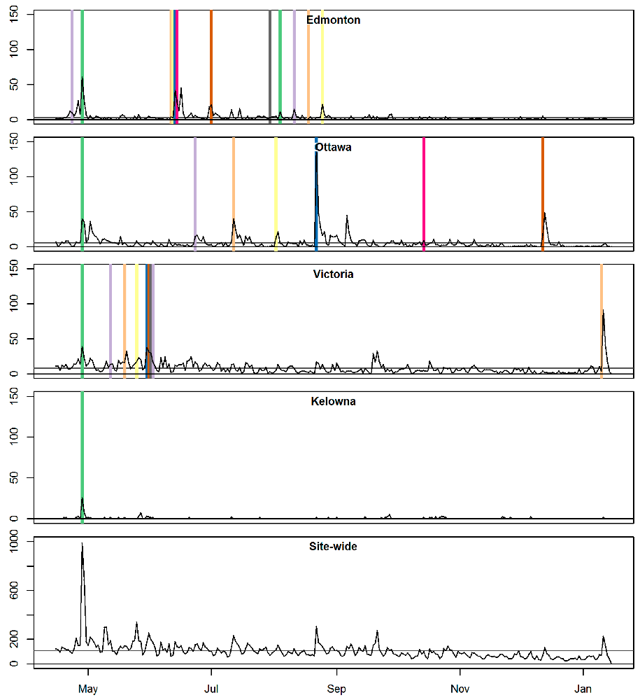
Figure 1. Web views (lines) and promotion events (vertical lines; not to scale)

    Incidents reported and promotion events. 
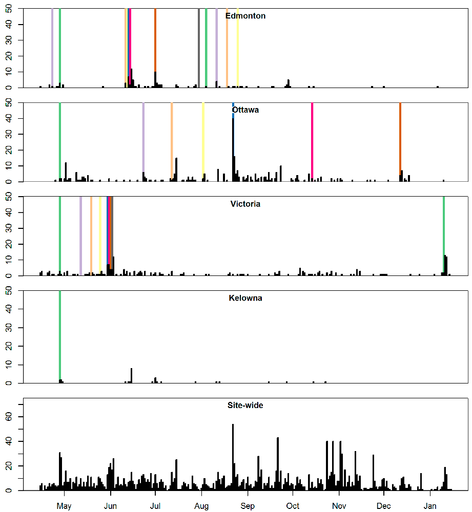
Figure 2. Incidents reported (barplots) and promotion events (vertical lines; not to scale)

    Promotion events.

    We hope that these published findings can be helpful for other crowdsourcing and citizen science projects in cities. With any luck, you’ll see us at the next cycling event in your city!

    Thanks for biking, and thanks for mapping!

    References Hou, Y., & Lampe, C. (2015). Social Media Effectiveness for Public Engagement. Proceedings of the 33rd Annual ACM Conference on Human Factors in Computing Systems - CHI ’15, 3107–3116. http://doi.org/10.1145/2702123.2702557

    Miller, C. C. (2006). A Beast in the Field: The Google Maps Mashup as GIS/2. Cartographica, 41(3), 187–199. http://doi.org/10.3138/J0L0-5301-2262-N779

    Winters, M., & Branion-Calles, M. (2017a). Cycling Safety: Quantifying the underreporting of cycling incidents. Journal of Transport & Health, 1–6. http://doi.org//10.1016/j.jth.2017.02.010

Older posts »